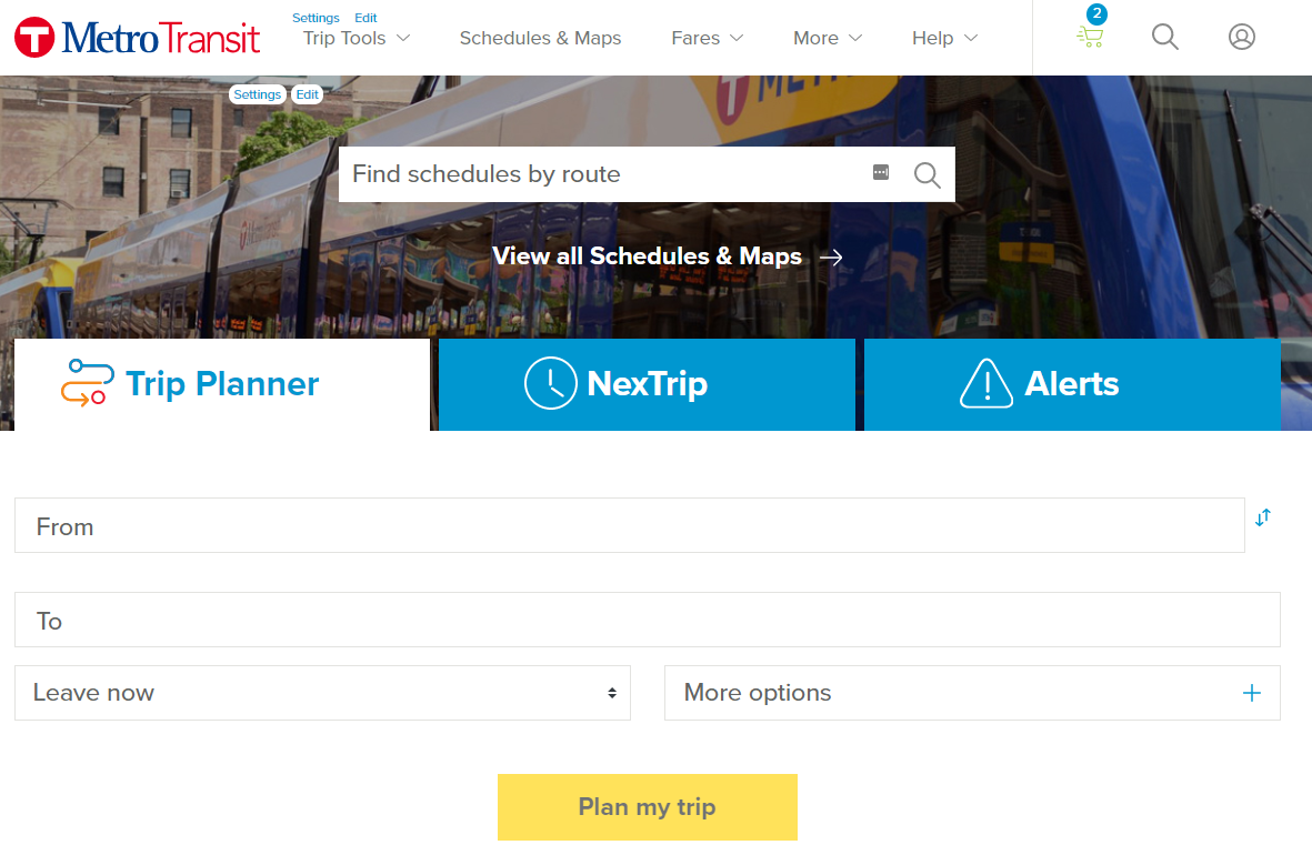
 In most cases, visitors to Metro Transit’s website have already decided they want to ride.
That’s why Metro Transit’s newly redesigned website puts trip planning, real-time information and service updates front and center. The new design will go live on Saturday, Dec. 14, following a lengthy review of best practices and user testing.
“We really put the focus on information that people coming to our website are looking for, which is what they need to know to take a trip right now,” said Senior Market Development Specialist Adam Mehl, who was part of a team that worked together on the redesign.
The new design also provides a cleaner and more modern look. Surveys showed some website users felt the previous design was outdated, which created some doubts about its accuracy. Metro Transit’s website was last updated in 2014, shortly before the METRO Green Line opened.
Other improvements included in the new design:
• A mobile-responsive design that automatically formats content to display correctly on most commonly used phones or tablets.
• The addition of autocomplete in the Trip Planner. Like the Google search bar, suggested addresses and landmarks will appear automatically as information is entered, reducing errors.
• Simplified navigation and more plain language (for example, “Schedules & Maps" has replaced “Routes & Schedules”).
• An updated interactive map with new icons.
There have been nearly 32 million unique visits to metotransit.org this year, a 5% increase from 2018. Around three-quarters of all website visits are on a mobile device.
Give us your suggestions and comments!
Tell us what you think of the website redesign by contacting Customer Relations.